Book Notes: The Village Grew By One October 16, 2025 / Ari Magnusson
A book cover tells a lot about a book. The overall image immediately speaks to the intended target audience and often suggests the book’s genre. The title provides a tantalizing hint of the story within, and the font can set the tone. And then there’s the name of the author—the one who wrote the book.
But that one name is quite misleading. A finished book often takes a whole team of people with a variety of skillsets to generate the finished product. My new book, Knights Without Ceremony: Insurrection, is no different. I started this book intending to write a short story. But the story of the characters and the world they inhabited grew and grew. I shared early drafts and portions with my writing group in a weekly meeting at a branch of the Boston Public Library. Revised portions were incorporated into the manuscript, which then went to friends and family for more feedback.
A book of thousands of words always contains two problems: typos and grammatical errors. For those problems, I used a professional editor named Natalie Mauceli. To date, Natalie has edited at least eight of my books (I’ve lost count given all the different editions of the nonfiction). She read the present book at least five times, each time following a major revision, and each edit resulting in hundreds of changes. She made the book much better.
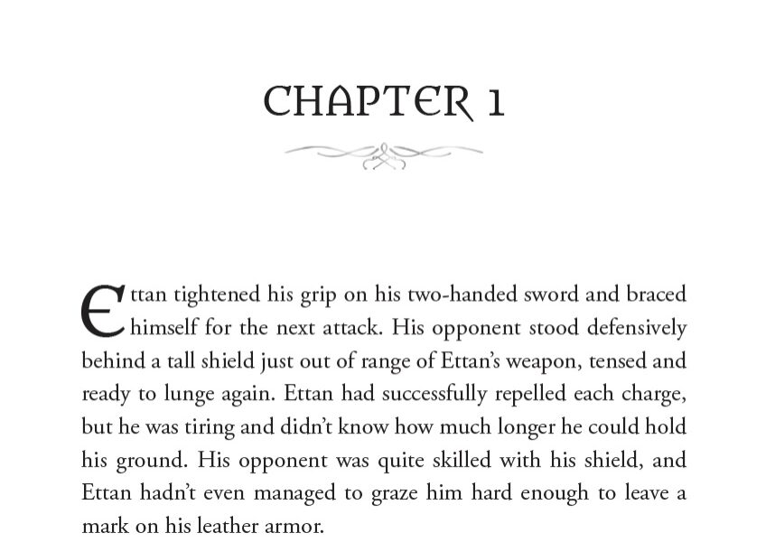
After the text was final, I sent it to Liz Schreiter, a book designer, to format the interior of the book. When I first published a book, I did it myself. Big mistake. Goofy indents. New paragraphs that didn’t (and still don’t) follow convention. Fonts that came native in Microsoft Word. Liz found a great font, including a stylized one for the leading character in each chapter that was similar to the title font, and properly laid out the text. The interior looks beautiful. You might open the book and see my words, but you see her presentation.
For the cover, I looked across the pond to a cover designer in England, Reece-Alexander Norris-Paterson, the only person I have ever met with hyphenated name pairs. I sent a mock-up of what I was looking for, and he rendered the cover beautifully, going far beyond my own suggestions and far exceeding my expectations. He turned mere words into an amazingly compelling image.
After the art was complete, Liz took the cover and, leveraging one of Reece-Alexander’s font suggestions, laid out the text, the UPC, and the publisher logo. The book was done—or so I thought.
I put the book on NetGalley, a service that makes books available to librarians, booksellers, reviewers, and others in advance of publication as a means of making the industry aware of the coming title and eliciting a few reviews. Platform members can request a book to read, and after confirming that they are legitimate requesters, I provide them with an ebook. And that’s how I became acquainted with Mark Buxton.
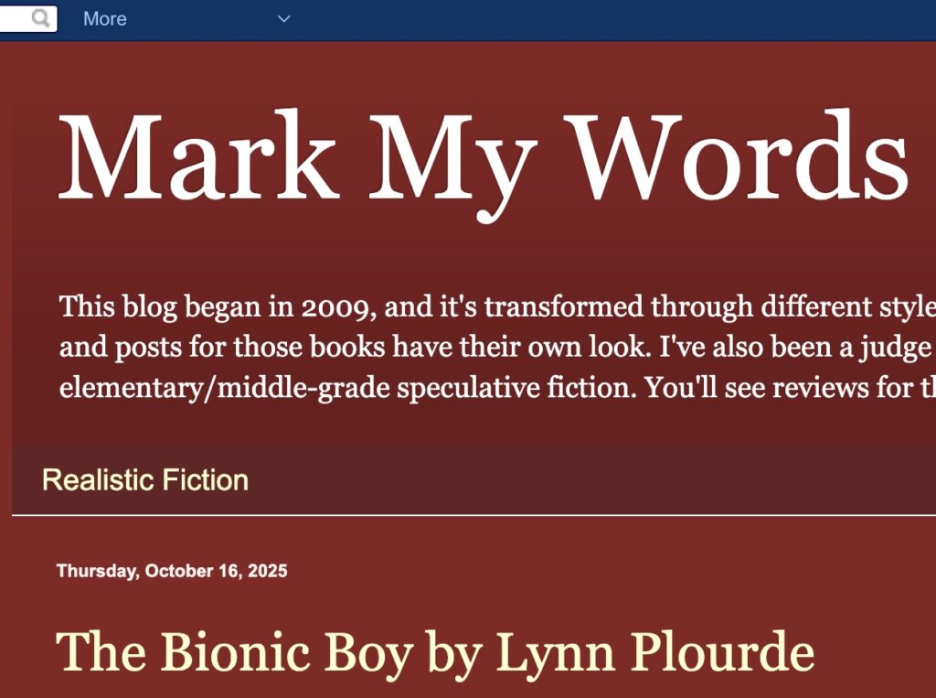
Mark runs a book review blog called Mark My Words (https://buxfantasy.blogspot.com/). He requested access to my book and, given the thoughtful reviews on his blog, I approved. The review was strong—five stars—however, Mark pointed out a critical flaw. The back cover text, or “jacket copy” in publishing parlance, didn’t actually fit the story. The text implied character actions that never occurred. Great book, he said, but the cover text didn’t work.
It didn’t take much consideration of his comment to know he was right. Jacket copy is not easy, at least for me. Good jacket copy makes a book exciting to read. It’s a sales pitch that has to sell a prospective reader on a book in a handful of sentences. I recalled that when I was making the original jacket copy, I had been exhausted. Getting the book to the finish had drained me. Not only that, but various personal events in my life had been stressful, and I just wanted to get the book out the door. So I rushed it. And in doing so, I had not only gotten the cover text wrong, but I had included a spoiler. Yes, I had spoiled a plot thread of the book—a book that I had painstakingly crafted over a twenty-seven-year period.
Updating the jacket copy was not easy. I agonized for days over what to say. After coming up with something that I thought was what I should have done the first time, I shared it with Mark. Since he was the one who pointed out the flaw, it made sense to get his feedback. Mark gave the new text a thumbs-up. After that, the text had to go to Natalie for editing. Once she worked her magic, the text went off to Liz to update the cover. Updating the cover was not just a copy/paste job but required laying out each line and adjusting the font size so the text block on the back of the book was pleasing to look at—with no hanging lines, asymmetry, or interference with the background art. And then, of course, I had to update all the places where that cover lived, including Amazon and Lightning Source—updates that required proof reviews and print service approvals.
Updating a cover post-publication was a first for me, but it made for a better book. And for that, I owe a huge thanks to Mark. My village for this latest book grew by one, and I’m thrilled and grateful that Mark was a part of it.

Subscribe
To subscribe to the posts, please enter your email address.


